TL;DR — Quick Answer
A well-designed digital menu can lift average order value 15–30% through proven menu engineering tactics. The biggest wins: add high-quality photos to your top 10 sellers (DoorDash data shows items with photos get 44% more orders), use the ‘decoy’ pricing strategy — anchor with one premium item to make mid-range options feel reasonable, place high-margin items in the top-right ‘sweet spot’ where eyes land first, and write item names that emphasize provenance (‘free-range chicken’ outperforms ‘chicken’). Group items into 4–6 short categories rather than one long list — scrolling fatigue kills conversion past 25 items per category. Use dietary tags (Vegan, Halal, Gluten-Free, Spicy) to help special-diet customers find their fit in seconds. Test your menu on a phone, in good and dim lighting, before publishing. The full impact compounds: a $2 lift on average check across 100 covers/day adds $73,000/year.
Your digital menu isn't just a list of dishes and prices — it's your most powerful sales tool. Every font choice, photo placement, category name, and price format influences what customers order and how much they spend.
The difference between a mediocre digital menu and a well-designed one can be 27–44% more sales per item, according to research from DoorDash and Cornell University. That's not a marginal improvement — for a restaurant doing $500,000/year in revenue, it's the difference between surviving and thriving.
This guide covers the research-backed design principles that actually move the needle: food photography, item naming, pricing psychology, category structure, and mobile-specific layout rules. Every recommendation is backed by published data — not opinion.
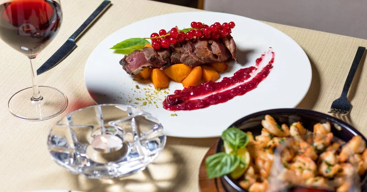
If you only change one thing about your digital menu, add photos. The data is overwhelming:
- DoorDash studied 15,000+ small restaurant merchants and found that menu items with photos generate up to 44% more monthly sales than items without photos
- GrubHub reports restaurants with menu photos see up to 70% more orders compared to text-only listings
- Deliveroo found a 24% increase in orders when photos are present
- 82% of people say they will order a dish based purely on how it looks in a photo, even if they hadn't planned to
This is the biggest advantage digital menus have over paper menus. A printed menu can fit maybe 3–5 photos without looking cluttered. A digital menu can show a photo for every single item — and each photo is optimized for the customer's screen.
Photo Tips That Work
- Start with your top 10 sellers — you don't need to photograph everything on day one
- Use natural lighting — smartphone photos in natural light outperform dark, flash-lit images
- Show the dish from above or at a 45° angle — these are the two most appetizing perspectives
- Keep backgrounds simple — the food should be the focus, not the table setting
- Match reality — over-styled photos that don't match the actual dish hurt trust and increase complaints
Don't have a digital menu yet? Our step-by-step guide to creating a digital menu will get you started in 5 minutes.
What you call a dish matters as much as what's in it. A landmark study by Wansink, Painter, and Van Ittersum at Cornell University tested the effect of descriptive menu labels in a six-week field study with 140 customers.
The result: items with descriptive labels had 27% higher sales than identical items with plain labels. Customers also rated the food as higher quality, better value, and said they were more likely to return.
Plain vs. Descriptive Names
Descriptive Names That Sell: The 27% Effect
| Plain Name | Descriptive Name | Category |
|---|---|---|
| Grilled Chicken | Herb-Crusted Grilled Chicken | Sensory |
| Pasta | Tuscan Sun-Dried Tomato Pasta | Geographic |
| Chocolate Cake | Grandma's Triple-Layer Chocolate Cake | Affective |
| House Salad | Crisp Garden Salad with Lemon Vinaigrette | Sensory |
The three most effective description types are:
- Sensory labels — texture and taste words: tender, crispy, satin, smoky, zesty
- Geographic labels — origin references: Tuscan, Cajun, Thai-style, Mediterranean
- Affective labels — emotional connections: home-style, grandma's, chef's favorite
Keep descriptions to 15–25 words per item — enough to entice, short enough to scan on a phone. One real-world example: a bar that renamed "House Bloody Mary" to a descriptive version with sensory language saw a 42% increase in orders for that item.
How you display prices affects how much customers spend — even if the actual prices don't change.
Remove the Dollar Sign: +8% Spend
A study at Cornell University's St. Andrew's Cafe by Yang, Kimes, and Sessarego tested three price formats: "$14.00" vs "14" vs "fourteen dollars." Diners who saw prices without dollar signs spent an average of $5.55 more (8.15%) per check. The dollar sign triggers the psychological "pain of paying" — removing it reduces that friction.
On a digital menu, this is a simple formatting choice. Display "12" or "12.00" instead of "$12.00" — the customer still understands it's the price.
Use Price Anchoring
Place your highest-priced item at the top of each category. This makes everything below it feel more reasonable — a well-documented cognitive bias called anchoring. William B's Restaurant reported a 10.2% increase in check averages after implementing price anchoring, without changing a single price.
Don't Align Prices in a Column
When prices are right-aligned in a neat column, customers' eyes jump straight to the prices and comparison-shop. Instead, place the price at the end of the item description, separated by a few dots or spaces. This forces the customer to read the description first — and by the time they reach the price, they're already engaged with the dish.
Avoid Price Trails
The dotted lines connecting dish names to prices ("Burger .............. $12") are a paper menu convention that screams "we're trying to get you to spend." On a digital menu, there's no need for them. Price comes naturally after the description.
How many categories should your menu have? How many items per category? Research points to a clear sweet spot.
5–7 Main Categories
Behavioral economics research based on Hick's Law (decision time increases logarithmically with the number of choices) and Barry Schwartz's Paradox of Choice (too many options reduce satisfaction) points to 5–7 main categories as optimal. According to ChowNow's menu optimization guide, this provides variety without overwhelming customers.
Typical structure: Appetizers, Mains, Sides, Desserts, Drinks. Add 1–2 more if you have distinct meal types (Breakfast, Lunch) or specialty categories (Chef's Specials, Kids Menu).
5–7 Items Per Category
The same research applies within categories. Qamarero's menu guide recommends 5–7 items per category, while some casual dining restaurants can go up to 10. Beyond that, decision quality drops and customers default to familiar safe choices instead of exploring high-margin items.
Put Your Stars First
According to Nielsen Norman Group's scroll research, users spend 57% of their page-viewing time above the fold and 74% in the first two screenfuls. On a mobile menu, that means your highest-margin, most popular items should be in the first 2–3 positions of each category — that's where the majority of attention goes.
A well-engineered menu structure can increase profit margins by 10–15% without adding a single new dish.
Over 90% of QR code menu scans happen on phones. Your menu must be designed for mobile first, desktop second. Here are the specific technical rules:
Tap Targets: 44px Minimum
Apple's Human Interface Guidelines require interactive elements to be at least 44×44 pixels. Google's Material Design recommends 48×48 pixels with 32px spacing between targets. If your menu items are smaller than this, customers will misclick, get frustrated, and stop browsing.
Font Size: 16px Minimum
Body text below 16px triggers auto-zoom on iOS Safari, which breaks the page layout. Item names should be 16–18px, descriptions 14–16px, and prices should match the item name size. Use sans-serif fonts (Open Sans, Roboto, Lato) — they're the most readable on screens, according to Terraslate's font readability research.
Contrast: 4.5:1 Ratio
WCAG accessibility standards require a 4.5:1 contrast ratio for body text. Low-contrast menus (light gray text on white) may look sleek on a designer's monitor but are unreadable in a brightly-lit restaurant. Dark text on a light background is the safest choice. For a deeper look at why this matters, read our analysis of QR code menus vs PDF menus and their accessibility differences.
Color: Use Warm Tones Strategically
Research by Satyendra Singh at the University of Winnipeg found that people make up their minds within 90 seconds of initial interaction, with 62–90% of that assessment based on color alone. Red stimulates appetite and encourages faster decisions. Orange and yellow also drive hunger. Use warm accent colors for category headers, highlights, and call-to-action buttons — but keep the base palette clean and readable.
Load Speed: Under 2 Seconds
Every additional second of load time increases bounce probability. Compress all food photos to WebP format, keep the total page under 500 KB, and avoid heavy animations. Customers standing at a table with their phone out have about 3 seconds of patience. For context on why speed matters so much, see our complete guide to digital menus.
How to Redesign Your Digital Menu for More Orders
Audit your current menu performance
Review which items sell best and which have the highest margins. If your platform provides analytics, check which items get the most views. Identify your Stars (high profit + high popularity) and Puzzles (high profit + low popularity) — those Puzzles are what you'll fix with better design.
Add photos for your top 10 items
Start with your best sellers and highest-margin dishes. Use natural lighting, shoot from above or at 45 degrees, and keep backgrounds simple. DoorDash data shows items with photos generate up to 44% more sales. You can add more photos over time.
Rewrite names and descriptions
Replace plain item names with descriptive ones using sensory, geographic, or affective language. Add 15–25 word descriptions that highlight key ingredients and what makes the dish special. Cornell research shows this alone can increase sales by 27%.
Restructure categories and item order
Limit to 5–7 main categories with 5–7 items each. Place your Stars and high-margin Puzzles in the first 2–3 positions of each category — that's where 57% of customer attention goes. Add a highlight or featured badge to items you want to push.
Optimize pricing display
Remove dollar signs and display prices as plain numbers (e.g., "12" instead of "$12.00"). Place your premium item at the top of each category for price anchoring. Don't align prices in a column — let them flow naturally after descriptions.
Test on your own phone
Scan your QR code and browse the entire menu on a phone. Check: Can you read item names without zooming? Are tap targets large enough? Do photos load within 2 seconds? Is the most important content visible without scrolling? Fix anything that feels frustrating.
Menu design isn't a one-time project — it's an ongoing optimization. The restaurants that see the biggest revenue increases treat their digital menu the same way e-commerce companies treat their product pages: test, measure, refine.
Start with the highest-impact changes first:
- Add food photos to your top 10 items (+44% sales per item)
- Rewrite item names with descriptive language (+27% sales per item)
- Remove dollar signs from prices (+8% average check)
- Restructure categories to put Stars first (+10–15% profit margin)
These four changes alone can increase your restaurant's revenue by 15–30% — with zero increase in food costs, labor, or rent.
If you don't have a digital menu yet, create your free menu on Menujo and apply these principles from day one. For the full cost comparison, see how much menu printing really costs.
Where to Put Your Menu
Once your menu is built, distribute it across the channels your customers actually use. The same QR-coded URL works everywhere — Instagram bio, Google Business Profile, WhatsApp Business, takeout bags, table tents — but each channel has its own setup quirks worth getting right.
- Menu distribution channel guides — overview of every channel and the workflow for each
- Restaurant menu on Instagram bio — Instagram's native 5-link feature plus prompt copy that lifts taps
- Menu on Google Business Profile — add the menu URL to your GBP listing for local-search discovery
- Restaurant menu on WhatsApp — click-to-chat menu sharing for markets where WhatsApp is the primary discovery channel
Related Guides
More resources for setting up and running a digital menu:
- Restaurant-type guides — setup playbooks for cafés, food trucks, bars, fine-dining, hotels, breweries, juice bars, pizzerias, and more.
- Digital menu for cafés — daily pastry rotation, milk-alternative tags, espresso variants, photo specs.
- Digital menu for food trucks — location-aware menu URLs, daily specials, mobile-first design for outdoor scanning.
- Restaurant + menu glossary — 75 terms covering menu engineering, QR-code mechanics, hospitality compliance basics.
- Free QR code generator — make a custom QR for any menu URL, SVG and PNG output, color customization, no signup required.
Key Takeaways
- Add photos to your top 10 sellers — DoorDash data shows 44% more orders on items with photos.
- Use decoy pricing: anchor with one premium item so mid-range options feel reasonable.
- Place high-margin items in the top-right ‘sweet spot’ where eyes land first.
- Write item names that emphasize provenance (‘free-range chicken’ beats ‘chicken’).
- Group menu into 4–6 short categories — scrolling past 25 items per category kills conversion.
- Use dietary tags (Vegan, Halal, Gluten-Free, Spicy) for special-diet discoverability.
- A $2 lift on average check across 100 covers/day adds $73,000 to annual revenue.
Frequently Asked Questions
Do food photos really increase restaurant orders?
Yes. DoorDash studied 15,000+ small restaurant merchants and found items with photos generate up to 44% more monthly sales. GrubHub reports restaurants with photos see up to 70% more orders. Deliveroo found a 24% increase. These are some of the most well-documented effects in restaurant technology.
What is the best digital menu layout for restaurants?
Use 5–7 main categories with 5–7 items each. Place highest-margin items in the first 2–3 positions per category (where 57% of viewing time occurs). Include food photos, 15–25 word descriptions, and prices without dollar signs. Ensure minimum 16px font size and 44px tap targets for mobile.
How do descriptive menu names affect sales?
Cornell University research found that descriptive item names (using sensory, geographic, or affective language) increase sales by 27% compared to plain names. Customers also rate the food as higher quality and express stronger intent to return. One bar saw a 42% increase in orders after renaming a single cocktail with descriptive language.
Should I remove dollar signs from my restaurant menu?
Research from Cornell University found that removing dollar signs from menu prices increased customer spending by 8.15% per check. The dollar sign triggers the psychological pain of paying. Display prices as plain numbers (e.g., 12 or 12.00) instead of $12.00 to reduce price sensitivity.
How many items should a digital menu have?
Optimal range is 25–50 total items, organized into 5–7 categories with 5–7 items each. This follows Hick's Law (more choices = slower, worse decisions) and the Paradox of Choice (too many options reduce satisfaction). Fine dining restaurants typically have 20–25 items; fast casual, 15–20.
What font size should I use for a mobile menu?
Minimum 16px for body text — anything smaller triggers auto-zoom on iOS Safari. Item names should be 16–18px, descriptions 14–16px. Use sans-serif fonts like Open Sans, Roboto, or Lato for best screen readability. Maintain a 4.5:1 contrast ratio between text and background per WCAG standards.
Does menu item placement affect what customers order?
Yes. Nielsen Norman Group research shows users spend 57% of viewing time above the fold and 74% in the first two screenfuls. Place your highest-margin items in the first 2–3 positions of each category. Items highlighted with visual boxes can see up to 25% more sales.
What colors increase appetite on a menu?
Research from the University of Winnipeg found that 62–90% of first impressions are based on color. Red stimulates appetite and encourages faster decisions. Orange and yellow also drive hunger — which is why most fast food brands use these colors. Blue and purple suppress appetite. Use warm accent colors for headers and highlights.
How can I increase average order value with menu design?
Combine multiple research-backed tactics: add food photos (+44% sales per item), use descriptive names (+27%), remove dollar signs (+8.15% per check), implement price anchoring (place premium items first), and put Stars in the first 2–3 category positions. Together, these can increase revenue by 15–30%.
What is price anchoring on a restaurant menu?
Price anchoring means placing your highest-priced item at the top of each category so that everything below it seems more reasonably priced. This is a documented cognitive bias. One restaurant reported a 10.2% increase in average check size after implementing price anchoring — without changing any prices.
How often should I update my digital menu design?
Review performance monthly: check which items get views but low orders (design problem), which items sell well (keep highlighting), and whether seasonal items need rotation. Major design refreshes (photos, descriptions, layout) should happen 2–4 times per year. The beauty of digital menus is that changes are instant and free.
Can menu design alone increase restaurant revenue?
Yes. The combined impact of proven design changes — photos (+44% sales), descriptive names (+27%), pricing psychology (+8%), and strategic placement (+10–15% margins) — can increase total restaurant revenue by 15–30% without changing food costs, staff, or rent. Menu design is one of the highest-ROI investments a restaurant can make.