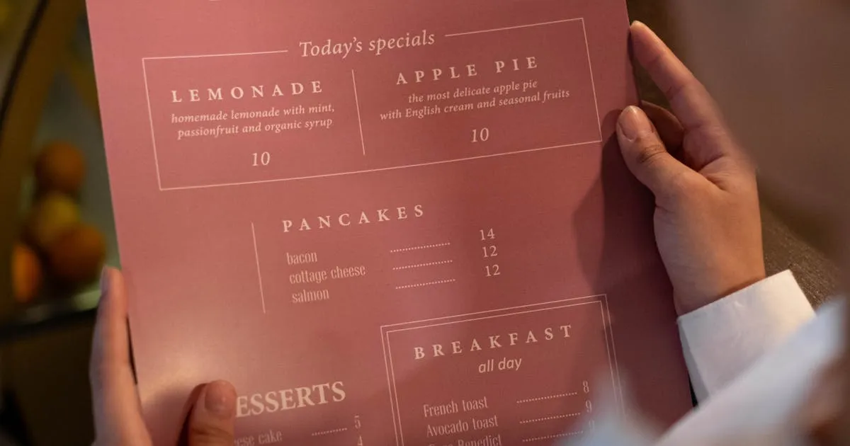
A paper menu tells you nothing. A customer picks it up, browses, orders, and the menu goes back on the table. You have zero data about what they looked at, how long they spent deciding, or what they considered but didn't order.
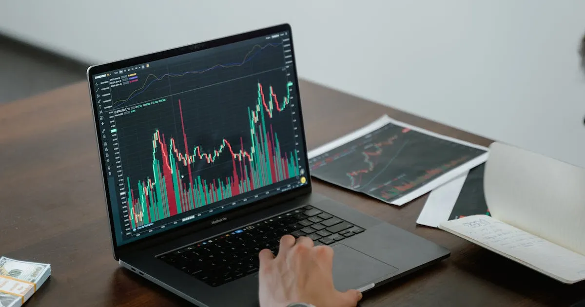
A digital menu is different. Every scan, every page view, every category tap is a data point — and when you understand that data, you can make smarter decisions about pricing, item placement, and promotions.
This is one of the most underused advantages of digital menus. According to NetSuite's menu engineering research, well-engineered menus can increase profit margins by 10–15% — and you can't engineer what you can't measure.
This guide covers what data digital menus actually track, what those numbers mean for your restaurant, and how to use them to make better decisions.
Most digital menu platforms track these core metrics:
1. Total Menu Views (Scans)
How many times your menu was opened — your most basic traffic metric. This tells you how many customers engaged with your digital menu. If you serve 200 tables/day but only get 100 scans, half your customers are using the printed backup or asking the server.
2. Unique vs. Returning Visitors
How many distinct devices viewed your menu vs. repeat scans. A high ratio of unique visitors means lots of new customers. A high ratio of returning visitors means regulars who keep checking — a sign your menu is working.
3. Views by Time of Day
When are people scanning? This reveals your digital menu's peak hours. If scans spike at 12:30 PM and 7:00 PM, those are your rush windows. If there's a dead zone from 3–5 PM, that's your opportunity for happy hour promotions or afternoon specials.
4. Views by Day of Week
Which days drive the most traffic? If Friday and Saturday dominate, your weekday marketing needs work. If Monday is surprisingly strong, you know to keep Monday specials running.
5. Device Types
iPhone vs. Android, and which models. This tells you what screen sizes to optimize for. If 70% of your scans come from iPhones, make sure your menu looks perfect on iOS Safari. If you see a significant Android share, test on Chrome for Android too.
6. Country / Language
Where are your customers from? If 20% of scans come from devices set to Spanish or Arabic, that's a clear signal to add those languages to your menu. See our multilingual digital menu guide for how to act on this data.
7. Category and Item Views (Advanced)
Which categories get the most taps? Which items get viewed but not ordered? This is the most valuable metric — it tells you what customers are interested in but might not be buying. That's a pricing, naming, or photo problem you can fix.
Data is only useful if it changes your decisions. Here are five specific actions based on common analytics patterns:
Action 1: Move High-View, Low-Order Items Up
If an item gets lots of views but few orders, it's a "Puzzle" in menu engineering terms — high potential but something is blocking the conversion. Common fixes: add a photo (items with photos get up to 44% more sales), rewrite the description with sensory language (+27% sales from Cornell research), or adjust the price.
Action 2: Optimize for Peak Scan Times
If your analytics show a scan spike at 12:15 PM, your lunch specials should be ready by 12:00. If evening scans peak at 6:45 PM, make sure your dinner menu is the active one by 6:30. Time your promotions to when customers are actually looking.
Action 3: Add Missing Languages
If 15% of scans come from devices set to a language you don't offer, you're losing 15% of potential tourist revenue. Even a basic translation of your top 20 items in that language can capture this audience.
Action 4: Test Menu Changes with Data
Changed your menu layout? Added photos? Rewrote descriptions? Track views and orders before and after. Digital menus let you run before-and-after comparisons that would be impossible with paper menus. Give each change 2–4 weeks of data before judging results.
Action 5: Identify Low-Traffic Days for Promotions
If Tuesday has 40% fewer scans than Friday, Tuesday is your promotion day. Run a "Tuesday Special" with a highlighted item or discount. Track whether the promotion brings scan counts closer to your peak days.
It's important to understand what digital menu analytics are and what they aren't:
What Menu Analytics Tell You
- How many people viewed your menu
- When and from what devices
- Which categories and items got attention
- Where your customers come from (language/country)
- How engagement changes over time
What Menu Analytics Don't Tell You
- What specific items each customer ordered (that's POS data)
- Total revenue or average check size (that's your accounting system)
- Why a customer chose one item over another (that requires testing)
- Customer names or personal information (menu platforms don't collect this)
The real power comes from combining menu analytics with POS data. If your menu analytics show that a "Chef's Special" category gets high views but your POS shows low orders for those items, you know the category is interesting but the items aren't converting — fix the descriptions, photos, or prices.
If your restaurant doesn't have a POS system or ordering platform, menu analytics alone still give you more insight than paper menus ever could. Even basic view counts help you understand whether your QR codes are being used and when customers are most engaged.
If you're new to menu analytics, here's what to expect and what to aim for:
| Metric | Typical Range | What to Look For |
|---|---|---|
| Scan-to-table ratio | 40–80% | Percentage of tables that scan the QR code. Below 40% = QR placement or awareness issue |
| Peak hours | Lunch: 12–1:30 PM / Dinner: 6:30–8 PM | Align promotions and specials with actual scan peaks |
| iPhone vs Android | 50–70% iPhone (varies by market) | Test your menu on the dominant device type |
| International language share | 5–30% (tourist areas higher) | Any language above 10% deserves a translated menu |
| Week-over-week growth | Stable to +5% | Consistent growth means your digital menu is gaining adoption |
Don't obsess over daily fluctuations. Look at weekly and monthly trends. A single slow Tuesday doesn't mean anything; four slow Tuesdays in a row means you need a Tuesday promotion.
How to Start Using Digital Menu Analytics
Set up a digital menu with analytics
You need a platform that tracks views. Menujo's Pro plan ($7/month) includes analytics with device types, country data, daily view charts, and top-performing menus. The free plan shows total view counts. Make sure your platform provides at least basic scan/view data.
Establish your baseline
Run your digital menu for 2–4 weeks before making any changes. This gives you a baseline: average daily views, peak times, device split, and language distribution. Without a baseline, you can't measure the impact of changes.
Identify your first insight
After 2–4 weeks, look for the most obvious pattern. Is there a dead zone in the afternoon? Are 20% of scans from a language you don't offer? Is one day of the week significantly lower than others? Pick the most actionable finding.
Make one change based on data
Run a promotion during the dead zone. Add a translation for the language you're missing. Create a special for the slow day. Change one thing at a time so you can measure its impact clearly.
Measure the result after 2 weeks
Compare the metric before and after your change. Did afternoon scans increase? Did Tuesday traffic improve? Did adding Spanish increase international visitor engagement? If yes, keep the change. If not, try a different approach.
Repeat monthly
Menu analytics is an ongoing practice, not a one-time setup. Check your dashboard monthly, identify the next opportunity, make a change, and measure. Over 6 months, these incremental improvements compound into significant revenue gains.
If you're still using paper menus, you're flying blind. If you have a digital menu but never check the analytics, you're leaving money on the table.
Here's the path forward:
- Get a digital menu with analytics — Menujo's free plan shows total views; Pro ($7/month) adds device, country, and daily charts
- Establish your baseline — 2–4 weeks of data before making changes
- Act on the most obvious insight first — the biggest gap is your biggest opportunity
- Combine with POS data if available — views + orders = the full picture
For tips on what to do with those insights, read our digital menu design guide (photo and naming techniques backed by research) and our menu printing cost analysis to understand the cost you're saving by going digital.
Frequently Asked Questions
What data can a digital menu track?
Core metrics include: total views (scans), unique vs. returning visitors, views by time of day and day of week, device types (iPhone vs. Android), country/language of the viewer, and on advanced platforms, category and item-level engagement. This is data that paper menus can never provide.
Do I need a paid plan for menu analytics?
Basic view counts are available on many free plans (including Menujo Free). For detailed analytics — device types, country data, daily charts, and top-performing items — you typically need a paid plan. Menujo Pro at $7/month includes comprehensive analytics. The insight you gain usually pays for itself within the first month.
How many menu scans should I expect?
A good scan-to-table ratio is 40–80%, meaning 40–80% of tables that have a QR code will result in at least one scan. If you serve 100 tables/day and see 50–80 scans, that's normal. Below 40% suggests a QR placement, awareness, or scanning problem — see our troubleshooting guide.
Does menu analytics collect personal information?
No. Digital menu analytics track device type, approximate location (from IP address, not GPS), language settings, and viewing behavior. They do not collect names, email addresses, phone numbers, or any personally identifiable information. It's aggregated traffic data, similar to website analytics.
How do I increase my QR code scan rate?
Make QR codes larger and more visible on tables. Add an instruction (Scan for our menu). Brief staff to mention the QR code. Place codes at the counter, entrance, and window. Use matte finish for better camera readability. See our complete guide on how to add QR codes to restaurant tables.
Can analytics tell me which items sell best?
Menu analytics show which items get the most views. To see which items sell best, you need POS (point of sale) data. The most powerful insights come from combining both: high views + low orders = a conversion problem (fix the photo, description, or price). Low views + high orders = a hidden gem (promote it more prominently).
How often should I check my menu analytics?
Weekly for a quick glance (are scans trending up or down?). Monthly for a deeper analysis (identify patterns, plan changes). Don't check daily — one slow Wednesday doesn't mean anything. Look for patterns over 2–4 weeks before making decisions.
What is a good time to run menu promotions based on analytics?
Run promotions during your low-scan periods. If analytics show a dead zone from 3–5 PM, that's when to promote afternoon specials. If Tuesday is your weakest day, run a Tuesday-only deal. If a specific hour has a scan spike, make sure your best promotions are live during that window.
Can I track which table scans the most?
If each table has a unique QR code or URL parameter, yes — you can track scans per table. This reveals which tables are busiest (useful for staffing) and which table positions result in more scans (useful for QR code placement optimization). Not all platforms support this level of detail.
How do analytics help with menu design?
Analytics reveal what customers look at most, when they look, and from what devices. Use this to: place high-margin items where they get the most attention (first in each category), optimize your menu for the dominant device type, add languages that your international visitors need, and time promotions to peak scan hours. For specific design techniques, see our menu design guide.